What color keeps you awake?
Share
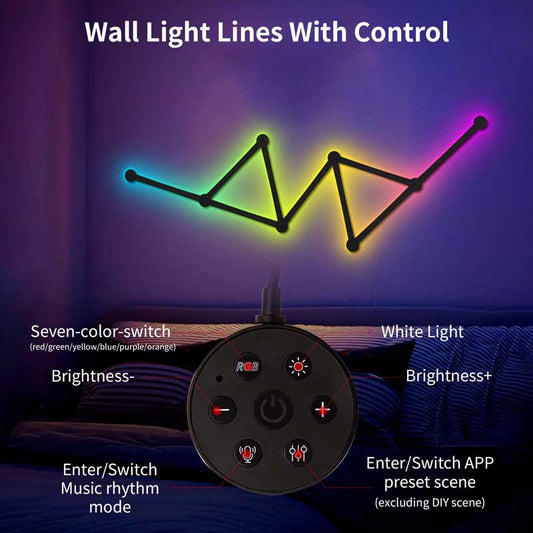
Certain colors are known to affect alertness and can either help you stay awake or promote relaxation. Here's a breakdown of colors that are associated with keeping you awake and alert:
1. Blue
- Blue light is often considered one of the most stimulating colors. It boosts alertness and helps improve concentration and focus. This is because blue light has a high energy wavelength, which can keep the brain engaged and active.
- It's commonly used in workplaces, study areas, and gaming rooms to promote focus. However, it’s also the kind of light you should avoid before bedtime, as it can interfere with your ability to sleep by suppressing melatonin production.
2. Red
- Although red light is often associated with relaxation, in some cases, it can actually help to keep you awake due to its intensity and how it stimulates the brain's attention centers. It has a strong visual presence that can keep your senses active.
- It's a great color for people who need to stay alert during the night or for environments where minimal distraction is needed (such as in military or emergency settings).
3. Green
- Green light is calming but also refreshing, making it a good choice to help maintain alertness without the harshness of blue light. It's especially useful in environments that require prolonged attention, like reading or studying, as it doesn't cause eye strain.
4. Yellow
- Yellow is another color that promotes energy and is mentally stimulating. It’s an uplifting color often associated with happiness and optimism. It can help improve mood and maintain a high level of alertness.
5. White
- Bright white light or daylight bulbs are also good for staying awake and focused. White light, especially with a cool temperature (blue-white), mimics natural daylight and can help stimulate your mind to stay alert and active.
6. Orange
- While more relaxing than blue or red, orange is a warm, vibrant color that can also keep you awake, particularly in low light settings. It's not as stimulating as blue but still provides a lively energy that helps prevent drowsiness.
In contrast, colors like soft warm tones (such as soft whites, pinks, or red-orange) tend to create a more relaxing and calming atmosphere, which may make it harder for you to stay awake.
So, to stay awake and focused, aim for lighting and decor with blue, green, yellow, or bright white hues.